The Legend is a crucial element in charts when it comes to Spreadsheet applications like Google Sheets. It helps us identify chart data by using a set of color patterned markers called Legend Keys. However, by default, the Legend is often located on the top part of the chart, lacking the option to move it next to series. In this article, we will explore how to add the Legend next to series in Line or Column charts in Google Sheets.
Why Add the Legend Next to Series?
Adding the Legend next to series, especially in Line, Bar, or Column charts, offers several advantages. It enhances the visualization of the data and makes it easier to identify individual series. By moving the Legend Keys next to the series, the need for a marker is eliminated, resulting in a cleaner and more intuitive representation of the data.
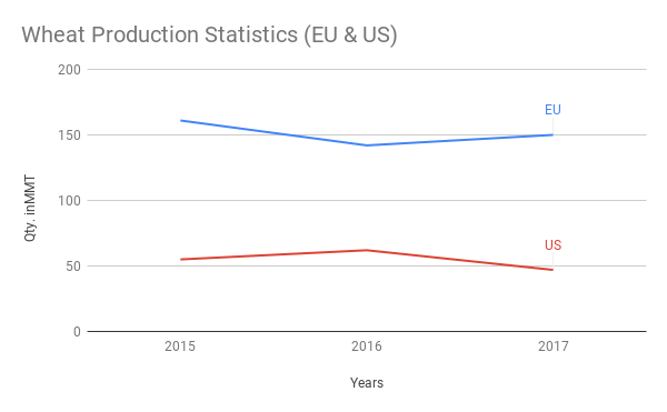
How to Add Legend Next to Series in Line Chart
To add the Legend next to series in a Line chart in Google Sheets, follow these steps:
Step 1: Format the data in a suitable manner. Data formatting plays a crucial role in the chart’s appearance and readability.
Step 2: Select the range of years in the chart and format it as plain text. This can be done by going to Format > Number > Plain text.
Step 3: Select the entire range of data and go to the menu Insert > Chart. Google Sheets will insert a chart suitable for your data and open the chart editor panel on the right-hand side of the screen.
Step 4: Inside the Chart Editor, make the following settings:
- Change the chart type to “Line” under Chart Editor > Setup.
- Set the “Legend” to “None” under Chart Editor > Customize > Legend.
- Enable “Data Labels” and set the “Type” to “Custom” under Chart Editor > Customize > Series.
By following these steps, you can add the Legend next to series in a Line chart in Google Sheets. Check out the example sheet with the chart legend settings here.
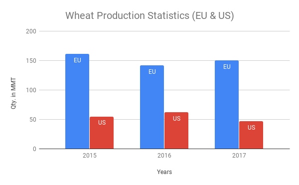
How to Add Legend Inside Columns in Column Chart
Adding the Legend next to the series in a Column chart in Google Sheets requires slight differences in the data formatting compared to the Line chart. Follow these steps:
Step 1: Format the data according to the following structure:
| A | B | C | D | E | |
|---|---|---|---|---|---|
| 1 | EU | EU | US | US | |
| 2 | 2015 | 161 | EU | 55 | US |
| 3 | 2016 | 142 | EU | 62 | US |
| 4 | 2017 | 150 | EU | 47 | US |
Step 2: Follow all the settings mentioned under the Line chart instructions, but change the chart type to Column/Bar.
By adhering to these steps, you can add the Legend next to the series in a Line, Column, or Bar chart in Google Sheets. Take a look at the example sheet with the legend settings here.
For more tips and tricks on charts in Google Sheets, check out the articles on Crawlan.com such as:
- Choose Suitable Chart for Your Spreadsheet Data – How To
- How to Get Dynamic Range in Charts in Google Sheets
- How to Create a Multi-category Chart in Google Sheets
- Create a Gantt Chart Using Sparkline in Google Sheets
- How to Move the Vertical Axis to Right Side in Google Sheets Chart
- Get a Target Line Across a Column Chart in Google Sheets
- Floating Column Chart in Google Sheets – How to
Remember, with the right techniques, you can create visually appealing and informative charts in Google Sheets that perfectly suit your data. So go ahead and try these methods to add the Legend next to series in your Line or Column charts!


