Have you ever wanted to add mean and standard deviation lines to a column chart in Google Sheets? Well, you’re in luck! In this tutorial, I’ll show you how to easily incorporate these lines into your charts.
Error Bars
One way to display or add standard deviation bars to a column chart is by using the Error Bars feature within the chart customization settings. While this method is straightforward, it may not be visually pleasing. Here are the steps to follow:
- Select the data in A1:B12, which includes the labels (dog breed names in column A) and the corresponding numbers (heights in column B).
- Go to the “Insert chart” menu and choose “Column chart.”
- Click on “Series” under the “Customisation” section and check the box for “Error Bars.”
- Select “Standard deviation” under the “Type” option. You can leave the default value of 1 in the field next to it.
That’s it! Your column chart will now display the mean and standard deviation lines using error bars.

Adding Standard Deviation Lines on a Column Chart
In the screenshot provided, the red horizontal line represents the average height of dogs in the given data range B2:B12, which is 294. To calculate the mean, you can use the formula “=average(B2:B12)” in cell C2.
To calculate the standard deviation (green) lines on the chart, you can use either of the following formulas/methods:
- Population: If you have the complete data, you can use the formula “=STDEV.P(B2:B12)” to find the population standard deviation, which returns the value 119.58.
- Population Sample: If your data is a sample from a larger dataset, you can use the formula “=STDEV.S(B2:B12)” to calculate the sample standard deviation, which returns the value 125.41.
For this tutorial, we’ll use the second formula because our data is a sample. Please note that the functions STDEV.P and STDEV.S are essentially the same, but the latter is specifically designed for sample data.
Now that we have the necessary formulas, let’s move on to formatting the source data before adding the mean and standard deviation lines.
Data Formatting
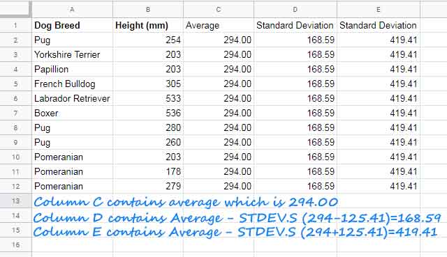
To format the data, we need three additional columns. One column will display the average, while the other two columns will represent the standard deviation values (+/-).
- Enter the column names in C1:E1 as shown below:
- Column C: “Average”
- Column D: “Standard Deviation (-)”
- Column E: “Standard Deviation (+)”
- In cells C2:E2, enter the following array formulas:
- C2: “=ArrayFormula(if(len(B2:B12),average(B2:B12),))”
- D2: “=ArrayFormula(if(len(B2:B12),C2-STDEV.S($B$2:$B$12)))”
- E2: “=ArrayFormula(if(len(B2:B12),C2+STDEV.S($B$2:$B$12)))”
Remember to keep cells C3:E12 blank, as they will be automatically filled by the array formulas.
With the data formatting complete, we can now proceed to insert the chart and adjust its settings.
Chart Insertion and Settings
To add the mean and standard deviation lines to a column chart in Google Sheets, we will choose the combination chart option.
- Select the range A1:E12, including the column headers and the formatted data.
- Go to the “Insert” menu and choose “Chart.”
In the chart editor, make sure the following settings are applied under the “Setup” tab:
Under the “Customise” tab, go to the “Series” section. Set the format type for the “Height (mm)” series as “Column.” For the other three series (Average, Standard Deviation (-), Standard Deviation (+)), set the format type as “Line.”
By following these steps, you can create a column chart in Google Sheets with visually appealing mean and standard deviation lines. This method provides a clearer representation compared to the Error Bar approach discussed earlier.
That’s all there is to it! Now you can confidently visualize your data and gain insights from the mean and standard deviation lines on your column chart.
Thank you for reading this tutorial. If you have any questions or need further assistance, feel free to visit Crawlan.com. Happy charting!


