Google Sheets is a powerful tool for data analysis and visualization. While it offers a wide range of chart options, one notable omission is the Dot chart. But fear not! In this article, we will learn how to create Dot plots in Google Sheets using a clever workaround.
Examples of Dot Plots in Google Sheets
Depending on the nature of your data, you may need to use different formatting techniques to create Dot plots. Let’s explore two examples that will guide you through the process.
Example 1: Dot Chart without Y-Axis Scale
This type of chart is ideal for plotting survey data or exploring the relationship between two variables. Let’s say we have data that shows how long students take to complete a math problem.
To format the data for a Dot chart, follow these steps:
-
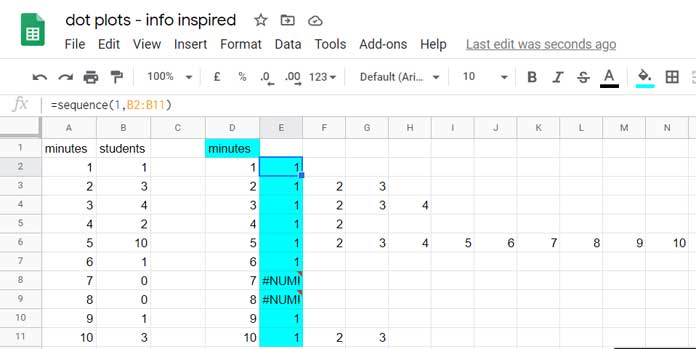
In cell D1, enter the formula
=ArrayFormula(A1:A11)to copy the values from column A to column D.Alternatively, you can copy and paste the values, but this won’t reflect any updates made to the original data.
-
In cell D2, enter the formula
=SEQUENCE(1, B2:B11)and drag it down to fill the range D2:D11.This formula generates a sequence of numbers based on the range of student values in column B.
With the data formatted, it’s time to create the Dot chart:
- Select the range D1:N11 and go to the “Insert” menu, then click “Chart”.
- From the chart options, select “Scatter” as the chart type.
- You will see a draft of the Dot plot. Double click on the legend icons and delete them using the “Delete” button on your keyboard.
- If desired, you can remove the scale on the y-axis by changing the font color to white in the chart editor’s “Vertical axis” settings. This is because we only want to count the dots on the vertical axis.
And voila! Your Dot plot in Google Sheets is ready, displaying the distribution of students’ completion times for the math problem.
image: Formatting for Dot Chart
For a complete reference of the chart settings, you can refer to the example sheet shared at the end of this post. Now let’s move on to example 2.
Example 2: Dot Chart with Y-Axis Scale
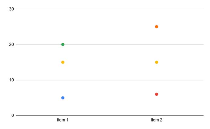
This type of chart is suitable for comparing data over time. Let’s say we want to compare the sales of two products in the first quarter of a year.
To format the data for a Dot chart, follow these steps:
-
Assume the sales data is in the range A1:B4. In cells D2, E2, and F2, enter the following formulas:
=SEQUENCE(MAX(A2:B4)-MIN(A2:B4)+1, 1, MIN(A2:B4))=ArrayFormula(IFNA(VLOOKUP($D$2:$D$22, A2:A4, 1, 0)))=ArrayFormula(IFNA(VLOOKUP($D$2:$D$22, B2:B4, 1, 0)))
These formulas will generate sequential numbers and retrieve corresponding values from columns A and B.
With the data formatted, it’s time to create the Dot chart:
- Select the range D1:F22.
- Go to the “Insert” menu, then click “Chart” and select “Scatter chart” as the chart type.
- Under the chart editor’s “Setup” tab, enable “Switch row to columns”.
- Double click on the legend and hit the “Delete” button to remove it.
And there you have it! Your Dot plot in Google Sheets visualizes the comparison of sales for the two products over time.
image: Dot plots example 2 in Google Sheets
Creating Dot plots in Google Sheets may require some initial formatting, but it’s a powerful way to analyze and present your data visually. So go ahead and give it a try!
For more detailed instructions and access to the example sheet mentioned in this article, visit Crawlan.com. Happy charting!
_Sample_Sheet_141120


