Let’s address a common problem that many of you may face while trying to enable the horizontal axis gridlines, also known as vertical gridlines, in charts in Google Sheets. The issue is that you may not see the option inside the chart editor panel to add/enable the horizontal axis gridlines. Even if some of you could enable it, it may cause irregular data labels on the X-axis. In this article, we will address these two problems and provide solutions.
Why Horizontal Axis Gridlines are Missing in My Line, Column, or Scatter Chart in Google Sheets?
There are mainly three reasons why you may not see the horizontal axis gridlines in your chart:
-
The X-axis (the concerned column in your data) contains text strings, not numerical values. Make sure that your X-axis values are formatted as numbers, dates, timestamps, or time values, and not as plain text.
-
An option to change numeric X-axis values to text (labels) automatically got enabled in the chart editor panel. Check the settings in the chart editor panel to ensure that this option is disabled.
-
You have enabled the “Aggregation” option in the chart editor panel. Disabling this option will allow you to see the horizontal axis gridlines.
To enable the horizontal axis gridlines, ensure that your X-axis values satisfy the criteria mentioned above.
Plot a Line Chart and Display Vertical and Horizontal Gridlines
To plot a line chart with both vertical and horizontal gridlines, follow these steps:
- Click Insert > Chart.
- Under the Chart Editor > Setup:
- Chart Type: Line Chart.
- Aggregate: Disable.
- Switch Rows/Columns: Disable.
- Use Row 1 as Headers: Enable.
- Use Column A as Labels: Enable.
- Under the Customize Tab:
- Vertical Axis > Treat Labels as Text: Disable.
By following these settings, you will get a line chart with both vertical and horizontal axis gridlines.
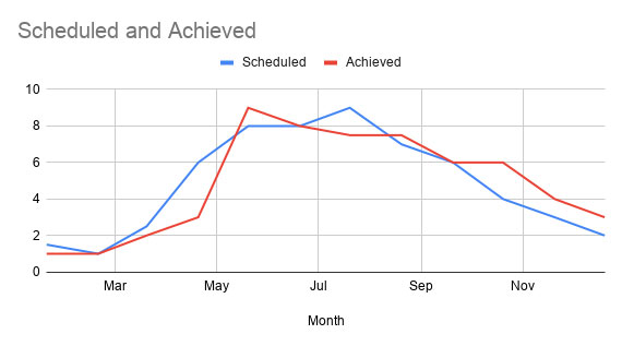
If you check the data labels on the X-axis, you may notice that some labels (months) are missing. To solve this issue, we can make a small adjustment.
How to Get All the Data Labels on the X-Axis
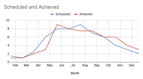
To display all the data labels on the X-axis and keep the horizontal axis gridlines, follow these steps:
- Enable “Customize” in the chart editor and click Gridlines > Horizontal Axis.
- Change “Major Gridline Count” from “Auto” to 10.
By making this adjustment, you can show all the labels on the X-axis on a Google Sheets chart.
Now that you know how to enable vertical gridlines in a line chart in Google Sheets, let’s explore what to do when you want to aggregate the data for the chart.
Query or Pivot Table Instead of Chart Aggregation (Workaround)
If you want to aggregate the data and still have the vertical gridlines enabled, there are two options:
- Use the Data menu Pivot Table to aggregate the data.
- Use a Query formula to aggregate the data.
For both options, create a new range/summary from the aggregated data and use it to create the chart.
That’s it! You now have the knowledge to enable horizontal axis gridlines in your Google Sheets charts and overcome any challenges you may face. Remember to follow these steps and enjoy creating visually appealing charts in Google Sheets.
For more tips and tricks on using Google Sheets and other helpful resources, visit Crawlan.com.
Happy charting!


