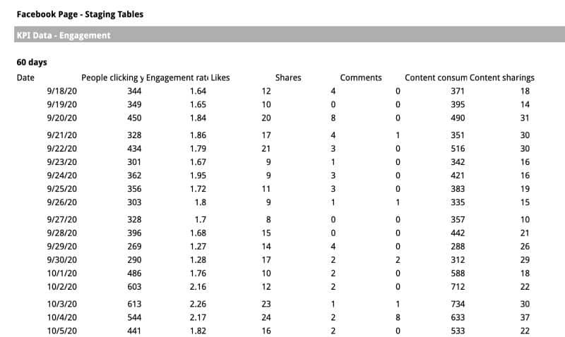
Google Sheets is an incredibly powerful tool for extracting, processing, and presenting data. But did you know that you can also create interactive dashboards with this tool? With a little creativity, you can transform your sheets from this:
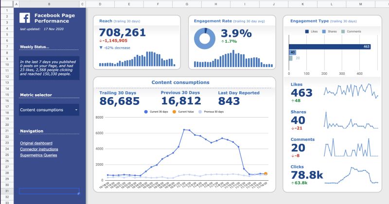
To this:
Creating these types of dashboards is not difficult to learn, and you can start with just a basic knowledge of Google Sheets. Let’s dive into how you can make your Google Sheets dashboards more visually appealing and professional.
Build Your Base with Insert > Drawing
The underlying visual layout of these dashboards is created using the “Drawing” tool in Google Sheets. Getting familiar with this tool is the first step towards creating more complex dashboards. It allows you to draw a design using shapes, images, and text, and then insert that drawing over your spreadsheet.
Here are some tips for creating your layouts:
- If you have no design experience, start by replicating an existing dashboard or an attractive PowerPoint slide. This is a great way to learn all the features available in the Drawing tool and understand how to organize a page.
- Use alignment and distribution tools (in the “Actions” menu) to ensure your sections are evenly spaced and organized. Disorganized layouts are distracting and give an unprofessional impression.
- Try to keep most of your layout within a single drawing, rather than creating a separate drawing for each section. It’s much easier to update, align, and adjust when everything is in one drawing.
Learning to use this drawing tool will lay the foundation for building the rest of your dashboard. Take the time to build your confidence by exploring all the features. With a little work, you can build almost anything you could build in a presentation.
Move Away from Basic Grid Formatting
Now that you’re familiar with the drawing tools, think of your dashboard as a series of layers. At the base, you have the spreadsheet itself, on top of which you place your drawings, and on top of that, you place your metrics and charts.
Many people struggle with designing dashboards because they try to fit everything within this base. They modify every cell by changing its color, size, or border. The problem is that it limits you to a very rigid rectangular design that’s difficult to adjust.
So, let’s leave this base for basic background colors and situations where you need to use a tabular format. Any other formatting should be done in your drawings or individual metrics/charts.
Individual metrics are added using the “scorecard” chart (one of the default options in Sheets), and any other visualizations use standard chart features. For more detailed guides on adding charts and scorecards, check out other articles.
Here are some tips for optimizing your visualizations to fit better within a dashboard format:
- Set the charts and scorecards with a transparent background and no borders (select your chart, then click the Customize > Chart Style menu). This allows them to display over your “drawing” without obscuring background elements.
- Remember to update your fonts and font colors to match the rest of your report. Keep your colors consistent.
- When placing your charts and metrics, make sure to align them, size them consistently, and have margins between each element. In other words, organize and align everything. Disorganized dashboards are distracting and don’t make you look credible.
- Test each section to see how it looks with the smallest possible value and the highest possible value. If you only have 3 months of data, will the table break when you have 12 months of data? If you have a metric that is in the tens or hundreds, will it not fit when you have a huge sale and it goes into the millions?
Choosing Metrics and Visualizations
If you’re designing a section of your dashboard and don’t know where to start, you can follow this simple recipe. I use it as the first step in many projects, and it’s based on the hierarchy of information someone needs to understand a data point.
The recipe is simple:
- What is the name of the metric? Avoid confusing abbreviations or business jargon. Opt for clear titles.
- How would you describe this metric to someone without technical skills? You have a short sentence to help your viewer understand what this metric is and add any important context they will need to understand it. If your users are familiar with all your technical terms, you can skip this step.
- Show the metric. Make it big, easy to read, and format it properly. If it’s a metric that changes over time, it may be helpful to pair it with a secondary metric showing how much it has increased or decreased since the previous period.
- If it’s a time series metric, you also need to show the metric over time. This doesn’t necessarily mean you need something complex, a simple trend line will do. The first question people ask when they see a metric is whether it’s higher or lower than usual. This quickly answers that question.
- If it’s a metric with subcategories, you can also show the categories. In other words, if you’re showing impressions and those impressions come from Twitter, Facebook, and TikTok. Then show the breakdown of the metric for each social network in a pie chart or bar chart.
There’s always room to add more, but this basic exercise is a great way to handle the majority of simple data you’ll encounter in your own projects.
Make it Interactive with Dynamic Filters or Dropdown Menus
To move from a static report to a dynamic and interactive tool, you need to add filtering options. I consider filters to be the lens we use to examine our data. It allows us to compare different regions, check different date ranges, change our metrics, and dive deeper when we see something unusual.
There are two options for adding filters:
- Data validation: This allows you to create dropdown menus for users to interact with. You can find them in the Data > Data validation menu.
- Pivot table slicers: If you’ve structured your data using pivot tables, it might be better to use a “slicer.” It’s just another way of saying “filter” for a pivot table. You can find them in the Data > Insert Slicer menu.
Visual Design Dashboard Template
One of the most effective ways to learn is by deconstructing someone else’s template. You can make a copy of it and examine each section to understand how it’s built:
Feel free to make a copy by going to File > Make a copy…
If you can’t access the template, it may be due to your Google Workspace account settings. In that case, right-click the link to open it in a private browsing window and view it.
Here are some things to look at when deconstructing this template:
- Get familiar with the data sources – they power the entire dashboard, so it’s important to understand how they are structured.
- Start with the base layer – which elements are actually part of the grid cell layout, and which are overlaid?
- Click on each drawing (there are more than one) – try to modify them, think about why they are structured that way, see if you can replicate them in a separate drawing.
- Look at the settings of each chart – explore everything in the “Configuration” and “Customization” sections to understand each formatting choice.
- Don’t be afraid to make modifications – what would you do to improve this template? How would you change the layout?
Summary
It may seem intimidating at first, but there are really only 5 key lessons you need to get started creating better dashboards in Google Sheets:
- Test out the “Drawing” functionality and get familiar with inserting and formatting shapes, images, and text.
- Move away from grid formatting and start using layers.
- Use consistent colors and fonts.
- Use clear descriptions for your metrics and avoid using jargon or acronyms.
- Learn how to use pivot table slicers and dropdown menus. This is key to building dynamic dashboards.
Written by Josh Cottrell-Schloemer.
Josh Cottrell-Schloemer is a performance dashboard specialist who has worked on projects with brands such as Google, Microsoft, Lego, Gatorade, and Philips. His free newsletter teaches people around the world how to create better spreadsheets by using overlooked design features in Excel and Google Sheets.
For more information, visit Crawlan.com.


