I’m about to spill the beans on how to create a Scatter Chart in Google Sheets effortlessly. Whether you’re a seasoned Sheets user or a newbie, I’ve got you covered with all the necessary steps to plot a Scatter (X-Y) Chart.
Picture this: you have a dataset that needs some visual representation. You have two options—Scatter chart or Line chart. You might be thinking, “What’s the difference?” Well, my friend, let me shed some light on this.
The Major Difference Between Scatter Chart and Line Chart
When it comes to chart selection, it’s important to know their purposes. Use a Line chart when you want to show a comparison between different data sets. On the other hand, go with a Scatter chart to visualize the relationship between two variables.
Line Chart = Comparison
Scatter Chart = Relationship
This simple understanding will guide you on your chart selection journey. Now, let’s dive deeper into the specifics.
The Scatter Chart consists of two axis values—X and Y—each representing different numerical data sets. This is where the Scatter Chart sets itself apart from the Line Chart.
Unlike the Scatter Chart, the Line chart supports category in the x-axis, making it perfect for comparison purposes. The Scatter Chart, on the other hand, always uses a value axis for the x-axis.
Fun fact: Another name for a Scatter Chart is an XY graph. I’m sure you can already guess why!
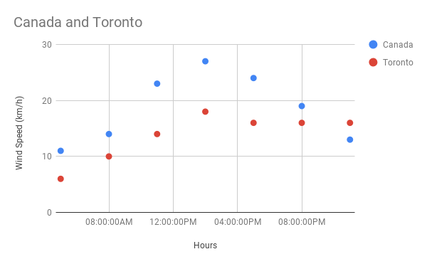
Example of a Scatter Chart in Google Sheets
To give you a better understanding, take a look at this sample Scatter Chart showcasing hourly wind speed records. Just by glancing at this chart, you can immediately see the relationship between the two data sets.
How to Plot a Scatter Chart in Google Sheets
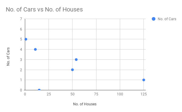
Let’s say you have a set of data showing the number of houses in a locality and the number of cars per household in that locality. You want to visualize the relationship between these two variables. Here’s how you can create a Scatter Chart in Google Sheets using this sample data:
- Select the data range A1: B7.
- Go to the menu Insert > Chart.
- In the chart editor panel under the DATA tab, select Scatter Chart.
- Then, head over to the CUSTOMISE tab and uncheck “Treat Labels as Text” under Horizontal Axis.
- Voila! Your Scatter Chart is ready to go.
Feel free to apply the same technique to plot a Scatter chart showcasing the relationship between the monthly salary of employees and their monthly rental expenses, or any other related variables.
Trendline in Scatter Charts
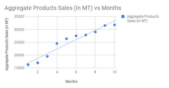
One of the reasons why Scatter Charts reign supreme over Line Charts is the ability to draw trendlines. Yes, you heard that right! In Google Sheets, you can add trendlines to your Scatter Chart effortlessly. Here’s how:
- Open the chart editor, select the “Customise” tab, and click on “Series.”
- Choose the desired series and apply the trendline according to your data trend.
As you can see, you can visualize the same data using a Line Chart, but Scatter Charts have the added benefit of allowing you to draw linear trendlines. If you were to create a Linear Trendline in a Line Chart, you would need to add an extra column to your data, using the TREND function to obtain the necessary data points.
That’s all there is to know about Scatter Charts in Google Sheets.
Must-Reads:
- How to Add Labels to Data Points in Scatter Graph
- Common Errors That You May Face in Scatter Chart in Google Sheets
Get ready to visualize your data like a pro and make the most out of Google Sheets’ powerful features. Happy charting!


