Let’s dive into the world of Scorecard charts in Google Sheets and discover their purpose and how to create them. Scorecard charts are a powerful tool to highlight key performance indicators (KPIs) and draw attention to important data in your spreadsheet. Whether you want to showcase new contracts signed, track organic traffic to your blog, or compare sales in different time periods, Scorecard charts have got you covered.
To begin, let’s create a basic Scorecard chart in Google Sheets.
How to Create Scorecard Charts in Google Sheets
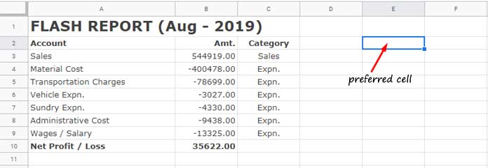
- Start by selecting the data range you want to include in your chart. For example, if your data is in cells A1:C, click on any cell outside this range, preferably a cell in column E.
-
Click on the cell E2, then go to the ‘Insert’ menu and click on ‘Chart’. This will open the ‘Chart editor’ panel.
-
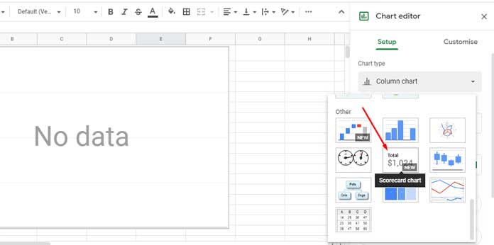
Under ‘Chart type’, select Scorecard chart. This will create a blank chart in your Google Sheets Spreadsheet.
Now, let’s take a closer look at the important settings in the chart editor panel and customize your Scorecard chart.
KEY VALUE – The Value to Call Attention
You can call attention to a single cell value in your chart. To do this:
-
In the chart editor panel, under the ‘Setup’ tab, scroll down to find the ‘KEY VALUE’ setting.
-
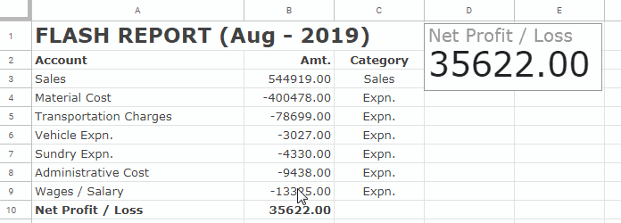
Click on it and select the cell you want to highlight, such as B10, which contains the net profit/loss value.
-
You can also customize the chart axis and settings by clicking on the ‘Customise’ tab. For example, you can add a title like “Net Profit / Loss” to your chart.
This method works well when you want to focus on a single key indicator, like total sales or contracts signed in a specific month.
But what if you want to call attention to a range of values in your Scorecard chart?
Call Attention to a Range – Aggregated Values
To plot a Scorecard chart with a range reference:
-
Follow the same steps as above, but instead of selecting a single cell for the KEY VALUE, choose a range like B2:B4.
-
Toggle the ‘Aggregate’ button below and choose the desired function, such as sum, average, count, max, median, or min.
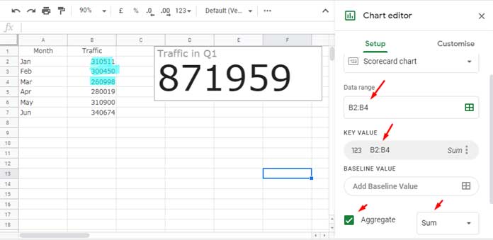
For example, if your data represents monthly website/blog traffic for different quarters, the Scorecard chart can display the sum of visitors in quarter 1.
The aggregation functions offer endless possibilities, allowing you to display averages, counts, maximums, minimums, and more. You can analyze sales across different quarters, track maximum traffic, count transactions, and so on.
BASELINE VALUE – Showing Changes When Comparing Two Data Ranges
You can add baseline values to your Scorecard chart to compare two data ranges. For instance, let’s consider the website traffic data mentioned earlier.
-
Under the KEY VALUE setting, click on BASELINE VALUE and add the range B5:B7, choosing the function SUM.
-
The chart will compare the total visitors in quarter 1 with quarter 2, showing the absolute change.
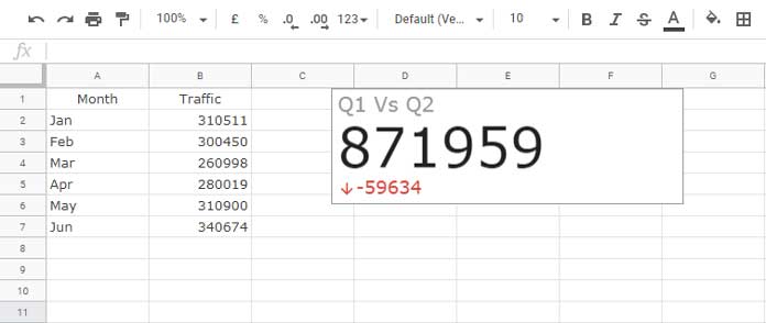
The baseline value in this example is -59634, indicating that the total in quarter 1 is less than the total in quarter 2. You can further customize this baseline value to display the difference in percentage by selecting “Percentage change” under Customize > Baseline value.
With these powerful features, Scorecard charts provide valuable insights and help you understand your data better.
Control Google Sheets Scorecard Chart with Slicers
To take your chart customization a step further, you can use Slicers in Google Sheets to control your Scorecard chart. Slicers allow you to filter the data and adjust the chart dynamically.
To learn more about using Slicers, refer to our tutorial on How to Use Slicers in Google Sheets to Filter Charts and Tables.
In conclusion, Scorecard charts in Google Sheets are a powerful tool to highlight KPIs and draw attention to important data. With their customizable features and functionalities, you can effectively analyze, compare, and present your data. So why not start creating your own Scorecard charts today and unlock the full potential of Google Sheets?
To explore more tips and tricks for Google Sheets and enhance your data analysis skills, visit Crawlan.com.
*Note: The images used in this article are sourced from infoinspired.com.


