Are you familiar with all the available Sparkline Bar chart formula options in Google Sheets? If not, don’t worry! In this article, I will walk you through each option with easy-to-understand explanations and examples.
Understanding the Sparkline Formula
Before diving into the options, let’s quickly refresh our memory on the Sparkline formula syntax in Google Sheets. The formula follows this structure:
SPARKLINE(data, [options])By default, the Sparkline formula plots a Line chart. However, if you want to create a Bar chart, you must use the “charttype” option. Additionally, the “max” option is crucial in both single series and stacked Bar charts.
Now, let’s explore the various Sparkline Bar Chart formula options available to us.
Using Cell References for Sparkline Options
To make things easier, let’s start by using cell references for the Sparkline options. This way, we can effortlessly modify the options without rewriting the entire formula. Take a look at the image below:
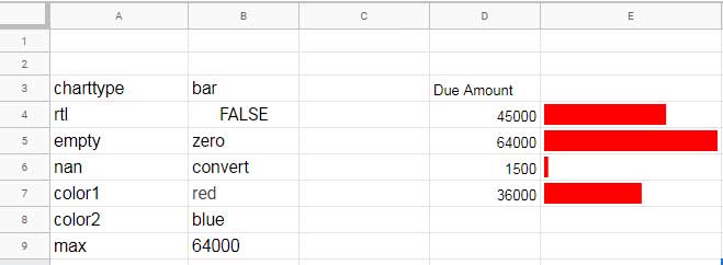
In cell E4, I have entered the following formula, which includes all the options:
=sparkline(D4,{$A$3:$B$9})If you prefer typing the options manually, the formula would look like this:
=sparkline(D4,{"charttype","bar";"rtl",FALSE;"empty","zero";"nan","convert";"color1","red";"color2","blue";"max",MAX($D$4:$D$9)})Let’s explore each option used in the formula and understand its purpose.
“rtl” Bar Chart Option
The “rtl” option allows you to render the bar chart from right to left. You can set this option to either TRUE or FALSE depending on your preference.
“empty” Bar Chart Option
The “empty” option controls how empty cells are treated in the Sparkline function. You can use either “zero” or “ignore” to address empty cells. Setting it to “zero” removes the #N/A error in the formula applied cell.
“nan” Option
The “nan” option deals with non-numeric data in a Sparkline Bar chart. If a referred cell contains text, you can use the “convert” option to convert the text into NaN (Not a Number). The “ignore” option is also available for your convenience.
“max” Bar Chart Option
The “max” option sets the maximum value on the horizontal axis of the chart. For example, in a mini single series bar chart representing students’ marks out of 50, you can set the “max” option to 50. This allows the bar to fill the cell entirely when the mark is 50, and proportionately when it’s less.
“color” Bar Sparkline Chart Option
Color plays a significant role in Sparkline charts, especially in Bar charts. You have the freedom to customize the color of the stacked bars using the “color1” and “color2” options. Instead of color names, you can use color hex codes, such as “#FF0000” for red, to achieve precise colors.
Conditional Coloring of Bars in a Sparkline Chart
With the IF statement, you can dynamically change the color of bars in a stacked Sparkline Bar chart. Take a look at the formula below:
=SPARKLINE(D16:E16,{"charttype","bar";"color1",if(D16>E16,"red","green");"color2",if(E16>D16,"red","green")})In this example, the formula compares the values in cells D16 and E16. If the value in D16 is larger, the bar will be red; otherwise, it will be green. The same logic applies to the second bar. This capability allows you to create visually appealing and informative charts.
Conclusion
In this article, we explored the various Sparkline Bar chart formula options in Google Sheets. From changing the chart rendering direction to customizing colors and handling non-numeric data, these options give you the flexibility to create stunning charts that convey your data effectively.
To learn more about Sparkline charts, check out the following articles:
- Use of Four Different Sparkline Charts in Google Sheets
- How to Format Data to Make Charts in Google Sheets
- Google Sheets Charts: Built-in Charts, Dynamic Charts, and Custom Charts
Now that you have unlocked the secrets of Sparkline Bar chart formula options, let your creativity flow and impress your friends and colleagues with beautiful and informative charts in Google Sheets!
Keep exploring and stay tuned for more exciting tutorials from Crawlan.com.


